Developing BOB
So who is BOB?
Bob stands for BUILD OUR BUSINESS and is an app designed to help businesses to find, store and share software business tools ideas. BOB was developed in the last weeks of Le Wagon Boot Camp batch #757 by Le Wagon sudents: Sarah, Yan and Emmanual.
Would you like to Explore the app BOB online Click HERE please note for best experience check it out in mobile view!
The Problem
Target: People looking for software to leverage to grow their businesses & complete tasks more efficiently.
Pain: Business owners & freelancers spend precious time trying to find the right software to use to complete their next task.
Solution: An all-in-one business software Wiki application with relevant software categorised for ease of access.
Originality: Rather than scouring blog posts and review sites on search engines, they can access relevant info in one place.
Product Overview
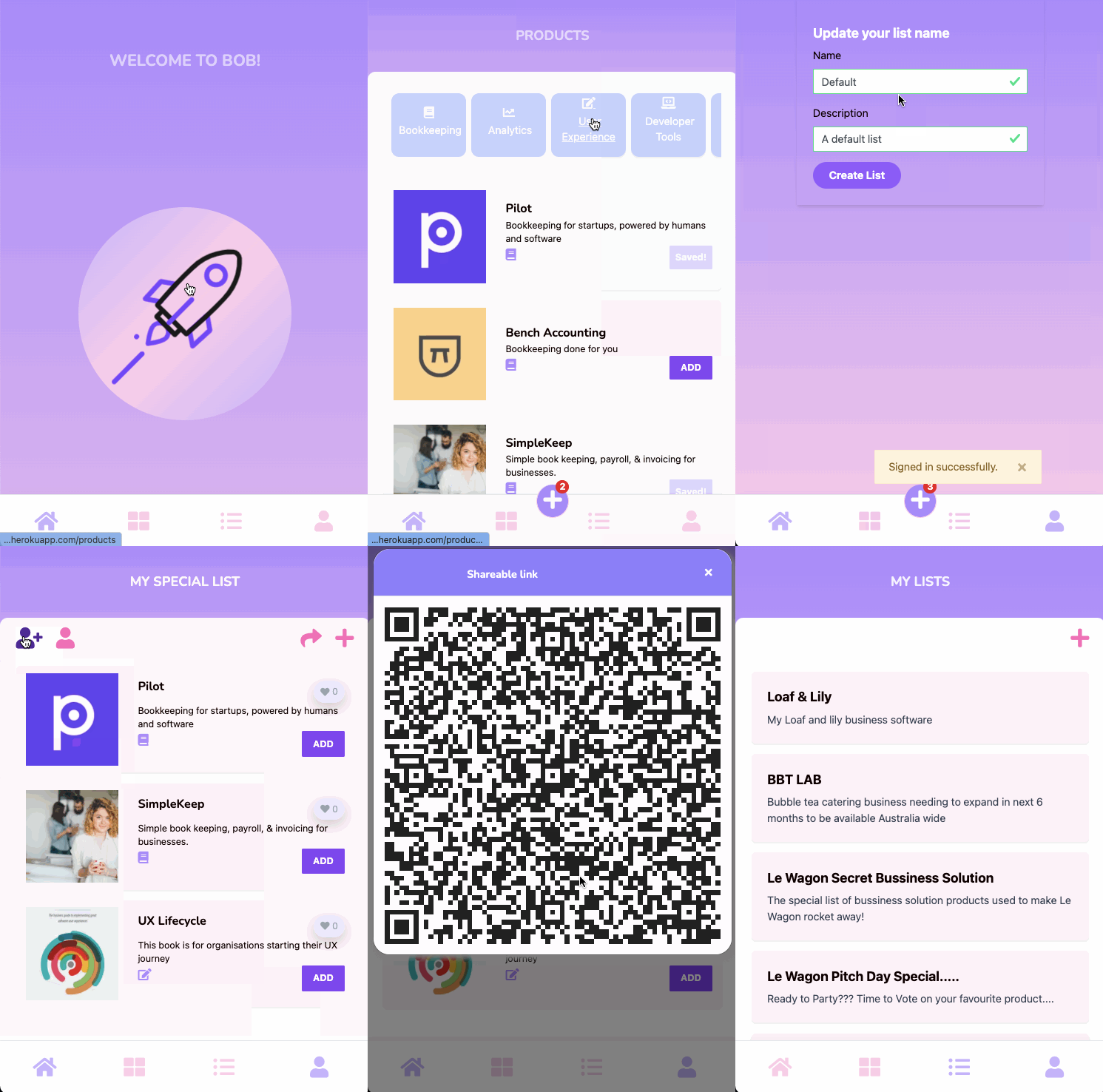
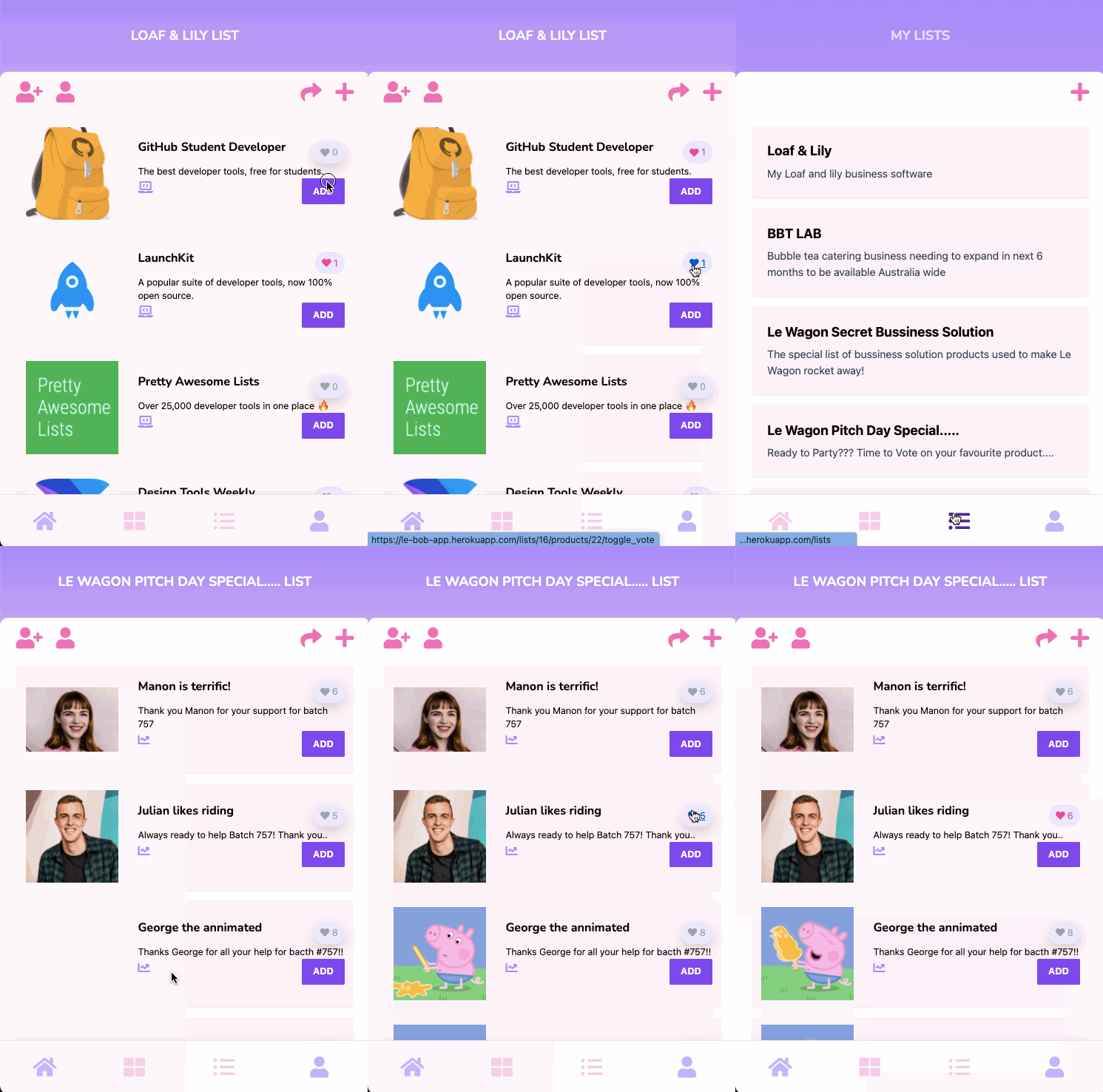
After and increible fortnight of huge learning curves, long nights coding and moments of panic our team uas able to finish the BOB app and present at the batch #757 pitch night!
Fig 1. BOB Find Products - Save Products- Create a List Fig 2. BOB Upvote Products - On Saved Lists
Backend
Gems
BOB utilized a number of gems in addition to general rails gems to help with the functionality of the final product:
Gem Function for BOB Detail ‘acts-as-taggable-on’
—To categorise Products
—used to categorise products, enable multiple
categorgies to be allocated to one product
—‘pagy’
—Use to paginate
—particularly useful when we were in development
and wanting to easily navigate from different views
—‘acts_as_votable’
—used to vote of products
in a list
—Enbles many colaborators of a list to
to vote on a product on a list
—‘stimulus-rails’
—a javascript library tied into
rails library
—when product was pressed the “to add” number
was automatically updates without having to update
the server
—‘rqrcode’
—qr code generation
—let BOB generate a QR Code to share a given list
—‘jwt’
—jwt for token signing
—worked wth qrqrcode gem let BOB generate
a QR Code to share a given list
—
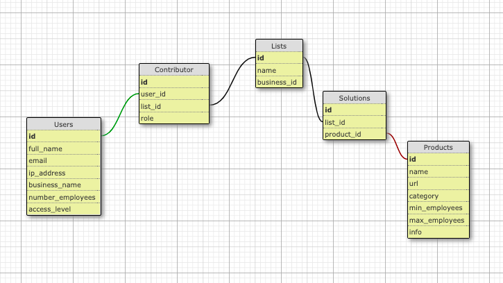
The Model Structure
Our model was made up of 5 tables and data for the product cards scrapped from Product Hunt.
The User Experience
When faced with creating an app with 3 enthusiastic juniors what the app looks like becomes a challenge. Load of ideas and how do we consolidate and agree on the final visuals? As a group we had a number of design sessions starting with crazy eights, some good old manual wireframing and also hunting for inspiration on the web. The final
BOB Design
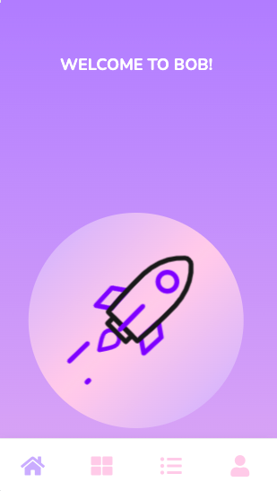
Our final design utilized the ideas generated form our crazy eights, wireframe work and inspirations (see below). The bright colours and simple designed aimed to have a minimalist look for a mobile app. simple bright colours to create a “brand” presence…..
Crazy Eights
An early initative was to undertake some crazy eight to help the group decide in the “look” for BOB. Want to know what CRAZY 8’s is all about?
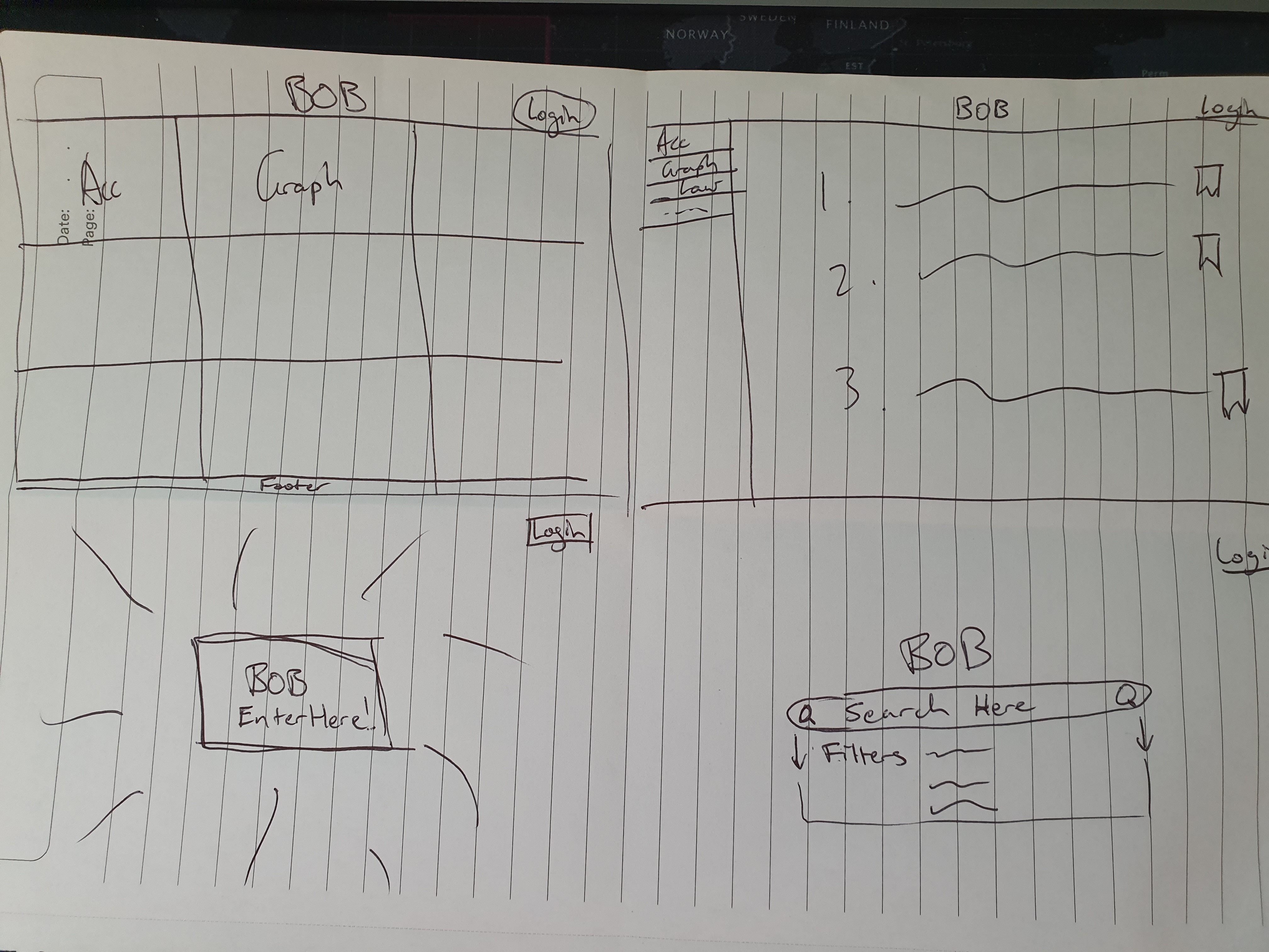
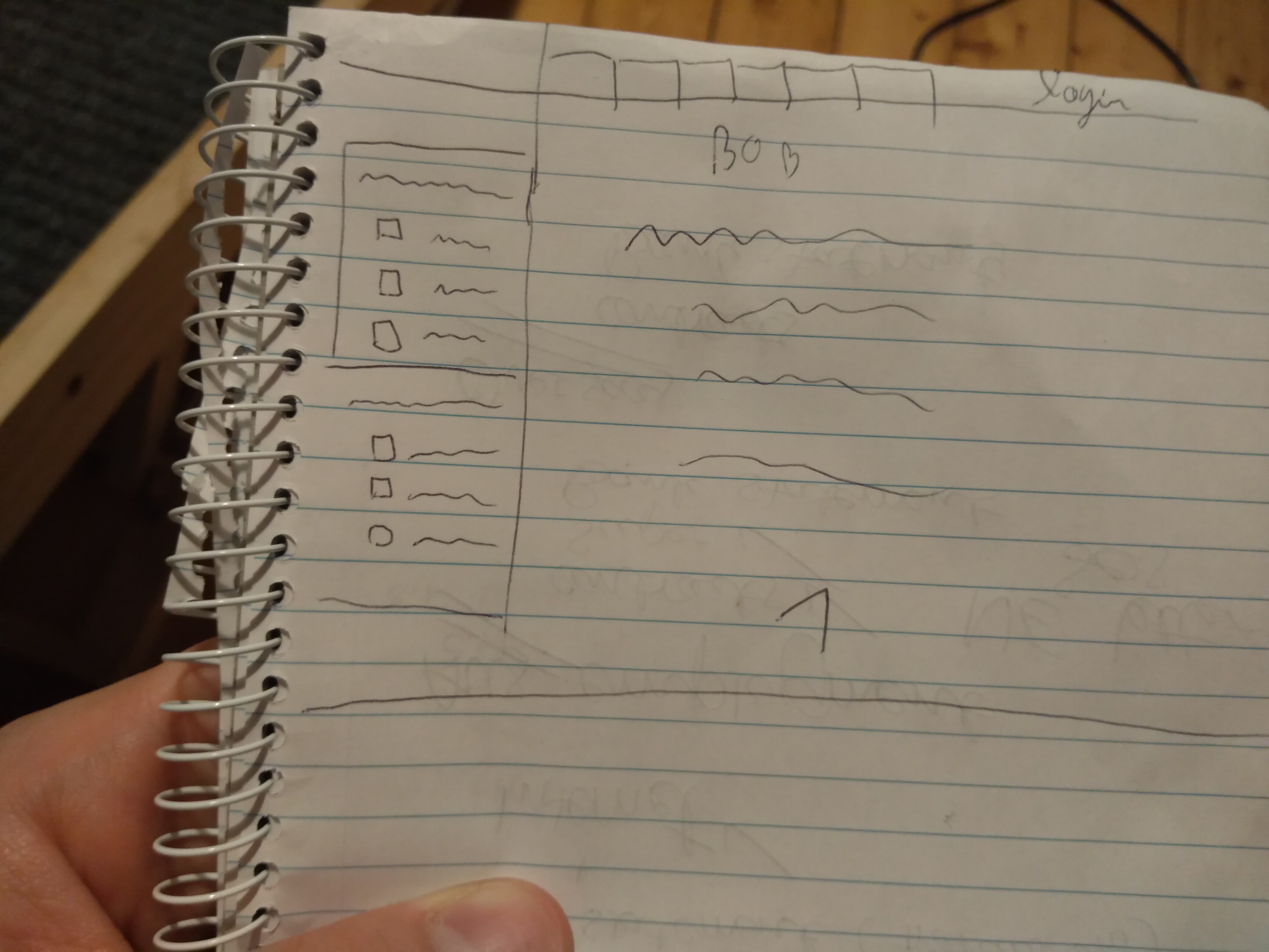
Sarah’s Crazy Eights Yan’s Crazy Eights Emmanual’s Crazy Eights
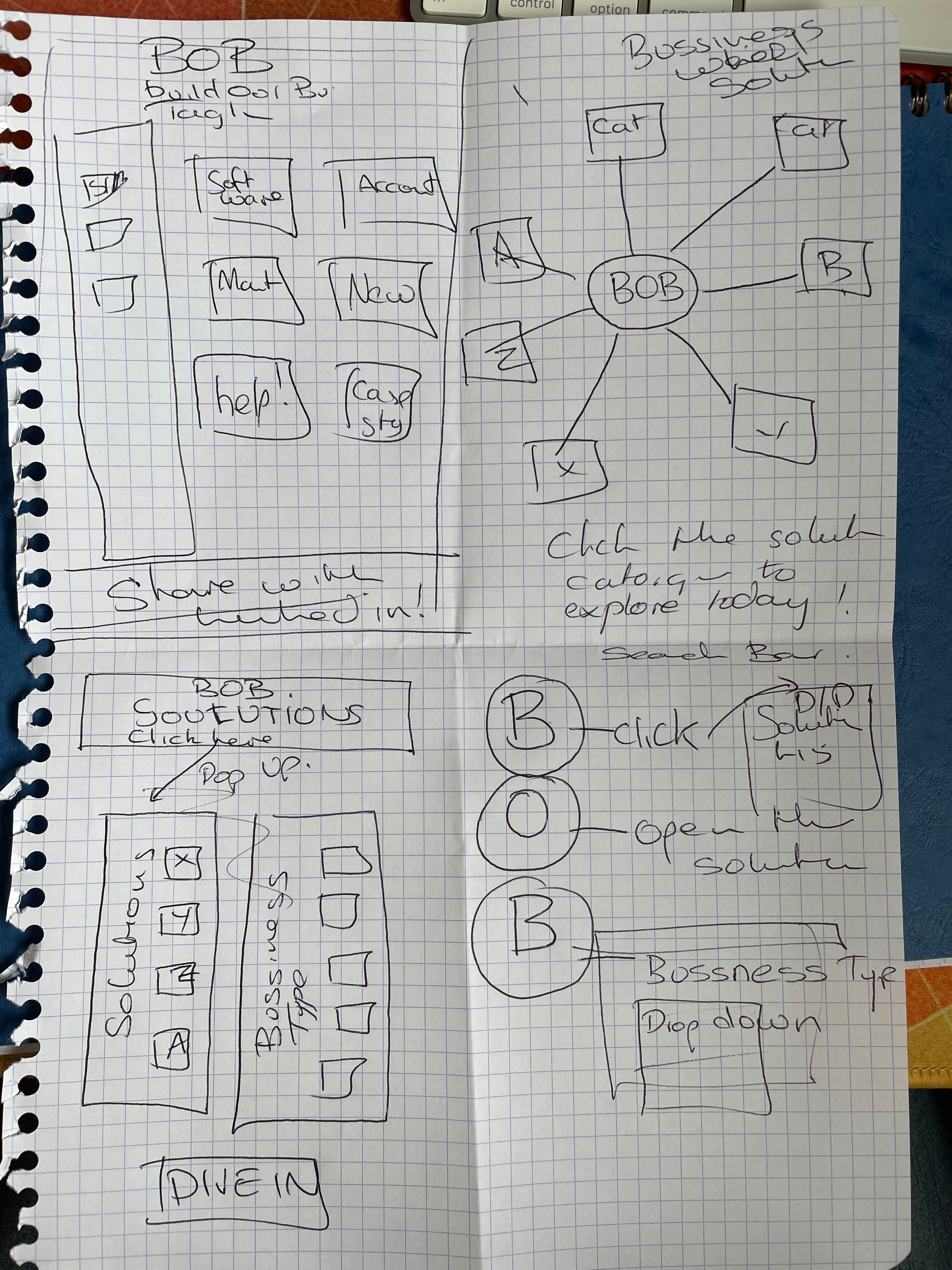
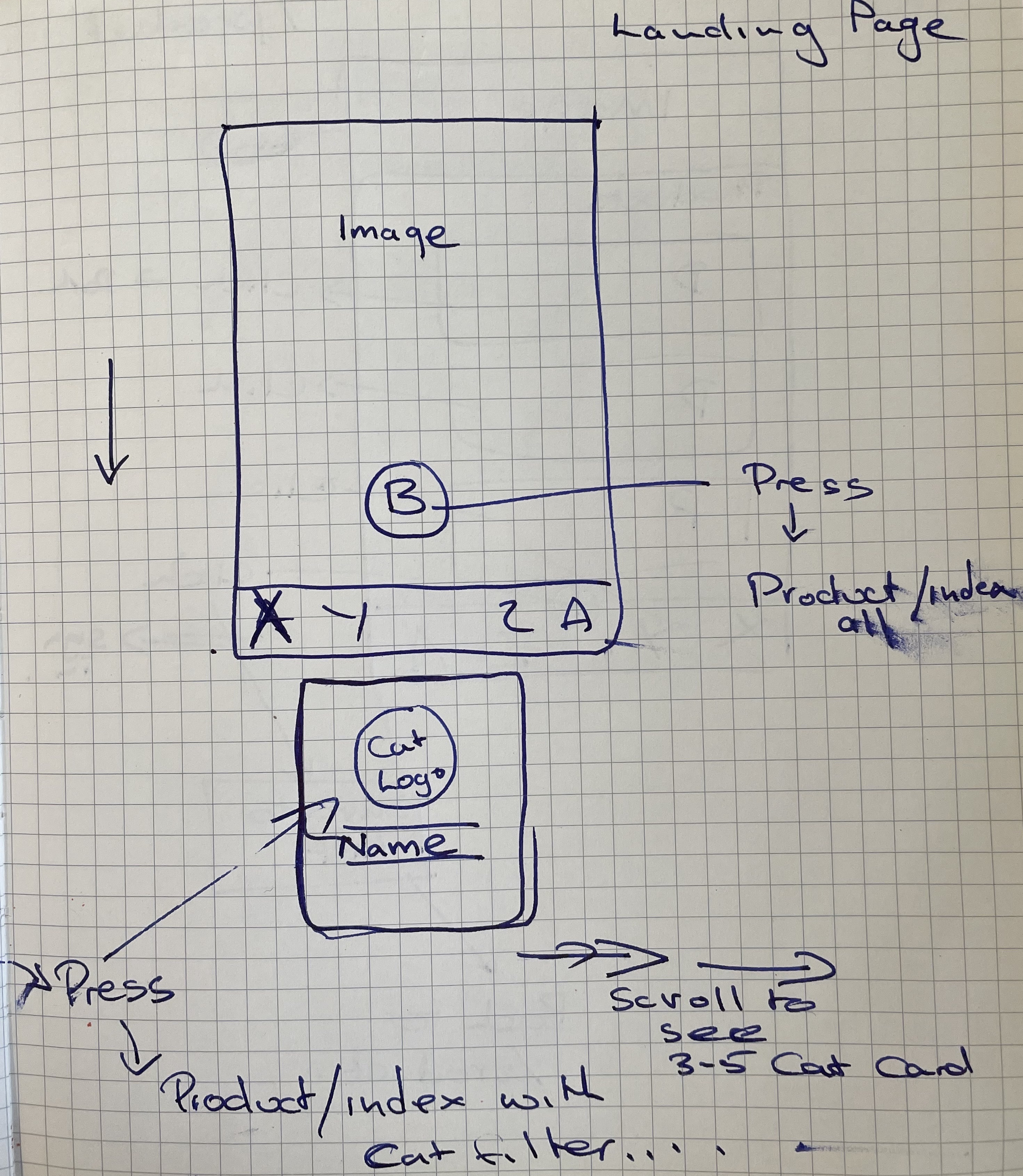
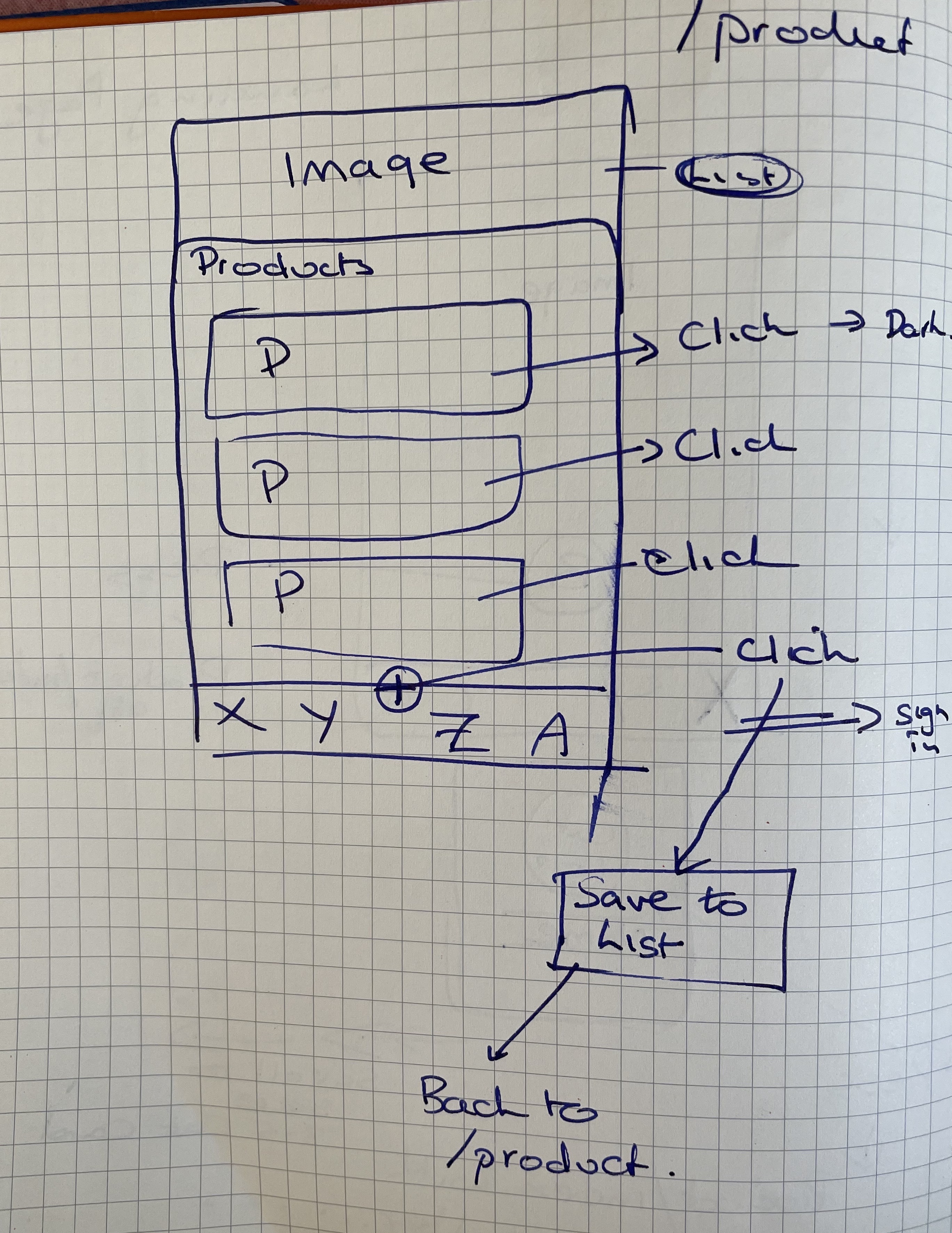
Wireframe… paper style
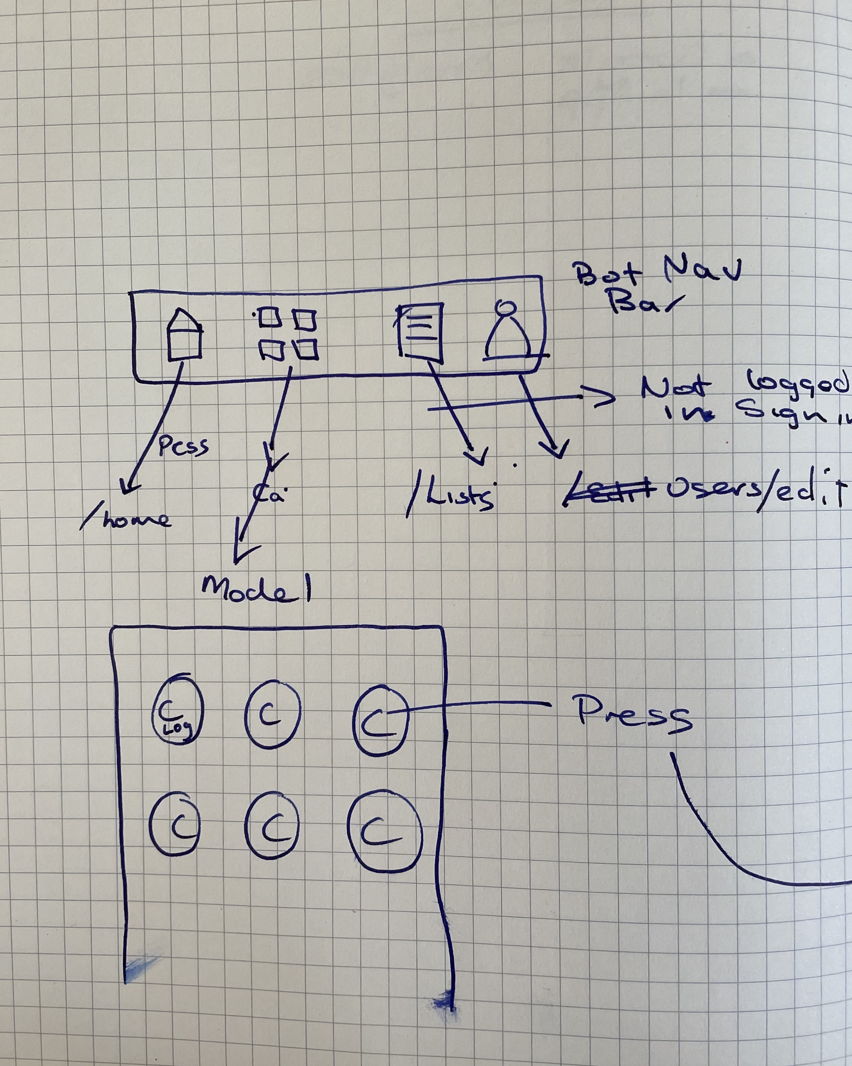
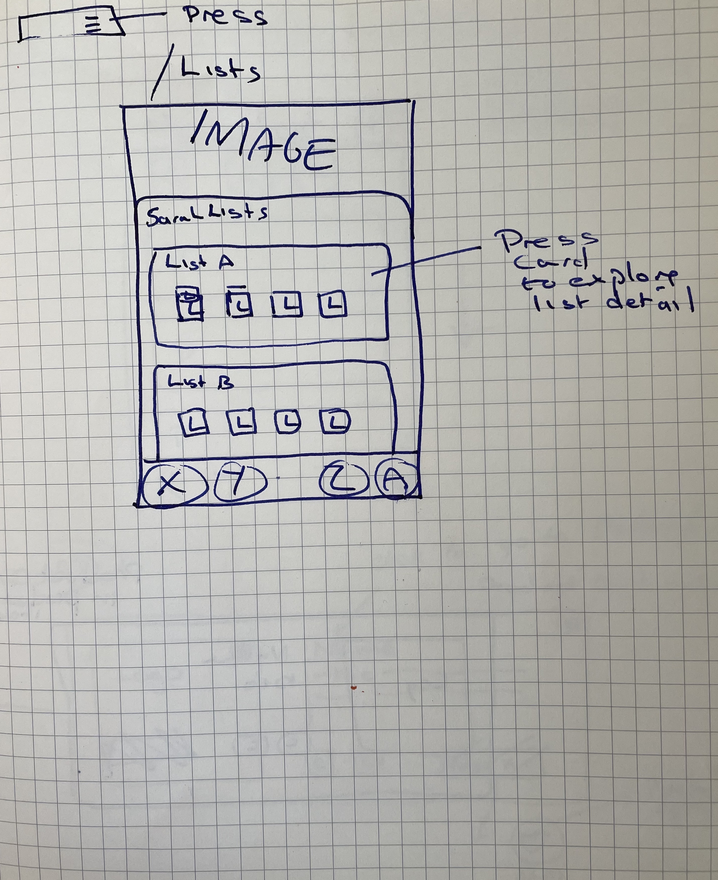
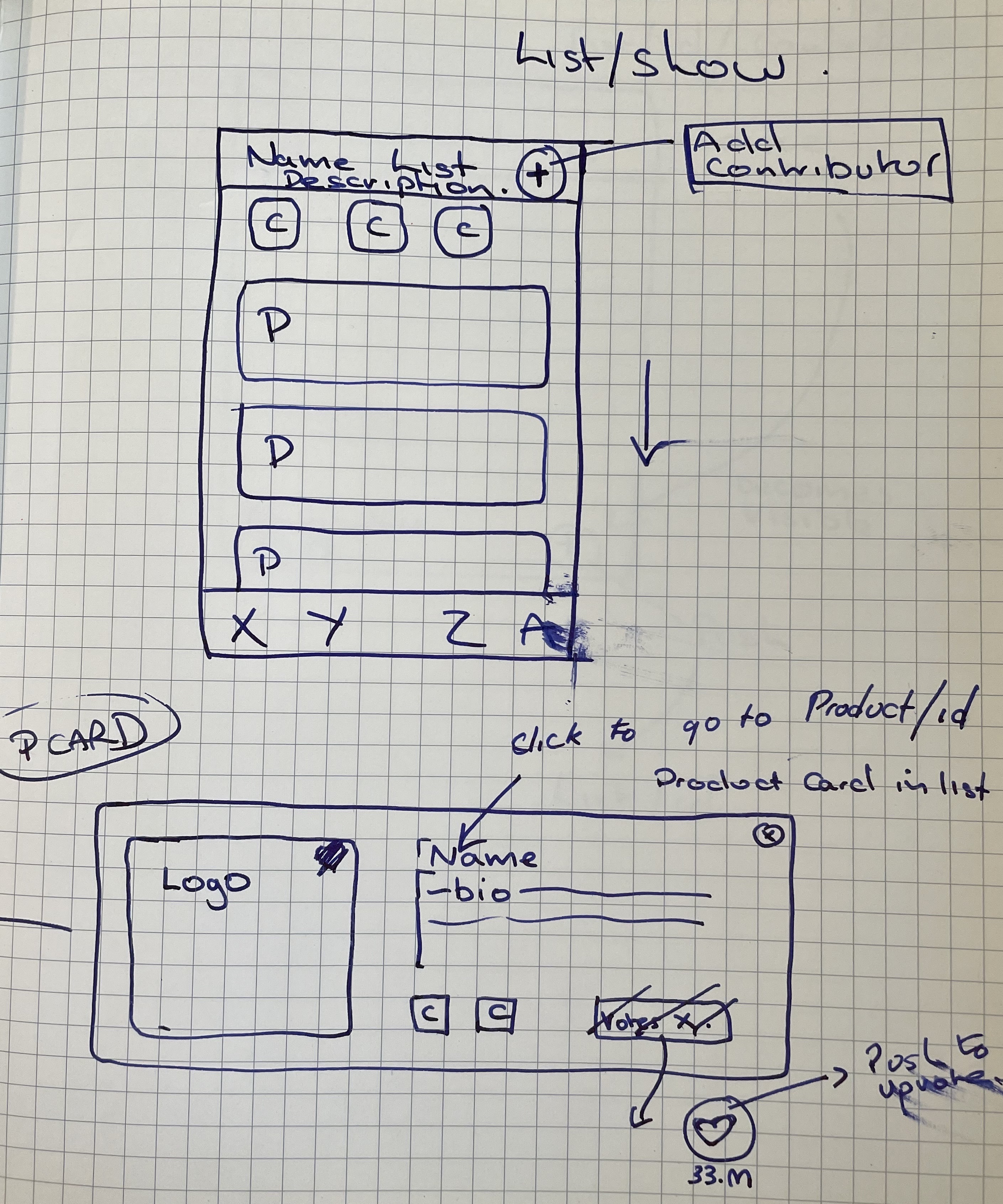
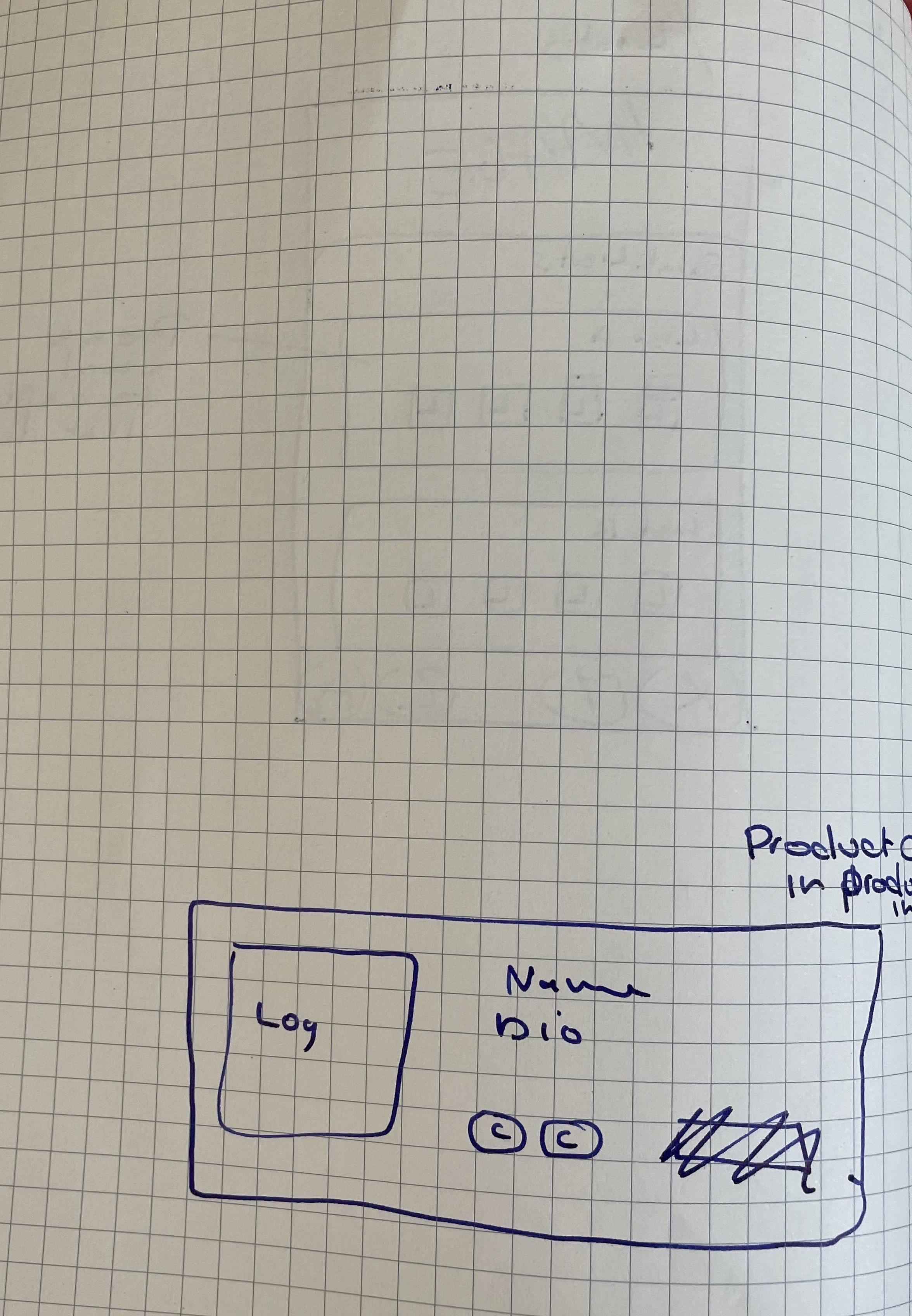
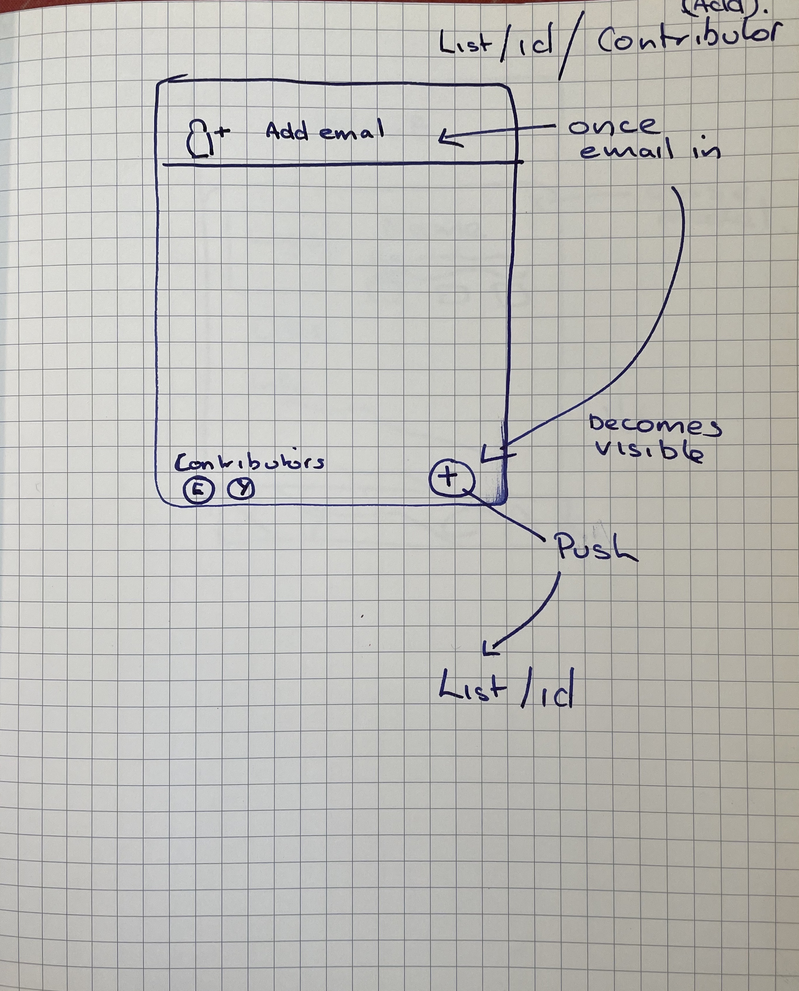
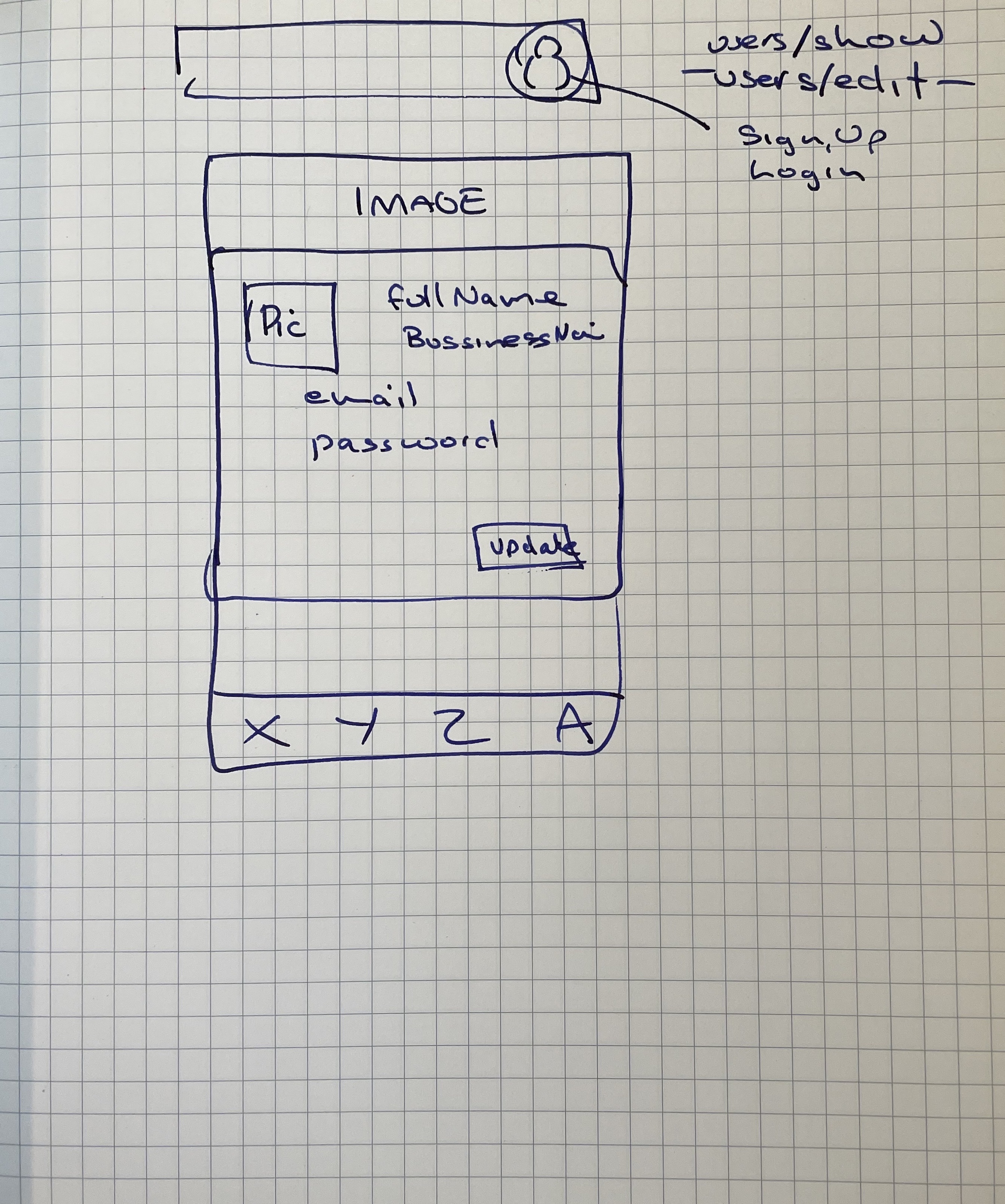
Design is hard and when it came crunch time we reverted to good old paper and pen…
“A Paper wireframe is a sketch or drawing that represents the skeleton of a website or an app interface. As the name suggests, it is often done on a sheet of paper or a whiteboard using a pencil or a pen for rapid simulation and testing. The designers translate their ideas into a sheet of paper to represent how the digital product would appear in the end. This way, the designers can communicate their ideas to developers, managers, and relevant stakeholders with a sketch on a sheet of paper.” [Peter Martinez] (https://mockitt.wondershare.com/wireframe/paper-wireframe.html)
At a critical point in production a one hour session deciding on the user flow and user interfact design enabled us as a team to work of differnt areas of the deig co-currently with the same “image” in our minds.
Inspirations
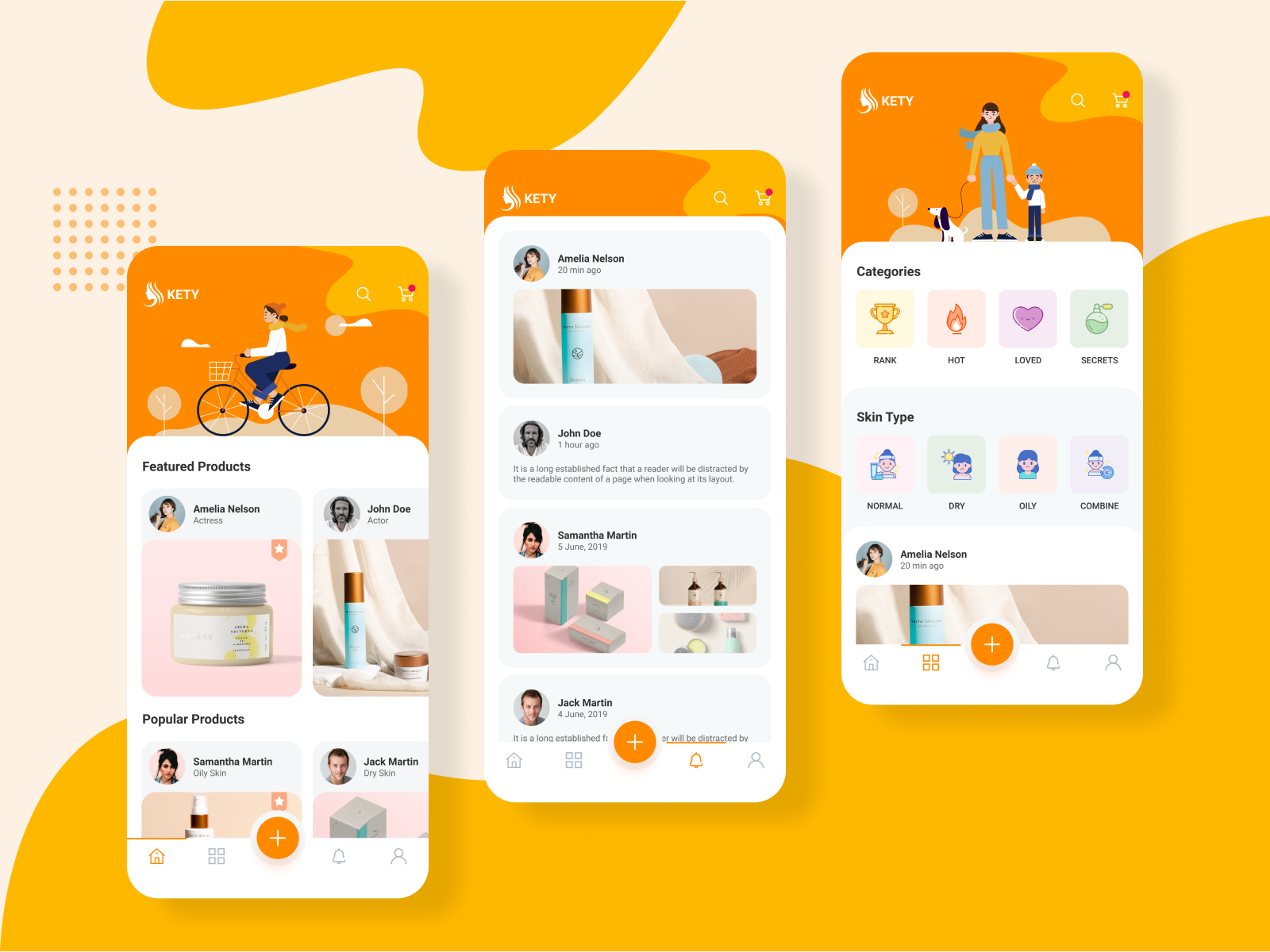
The internet can be a terrific space for inspiration and yet overwhelming without other ideas in mind… we utilized the following to help focus on functionality rather than spending lots of time on front end when the deadline mattered. This design underpinned the final design was found on Canva
The Team
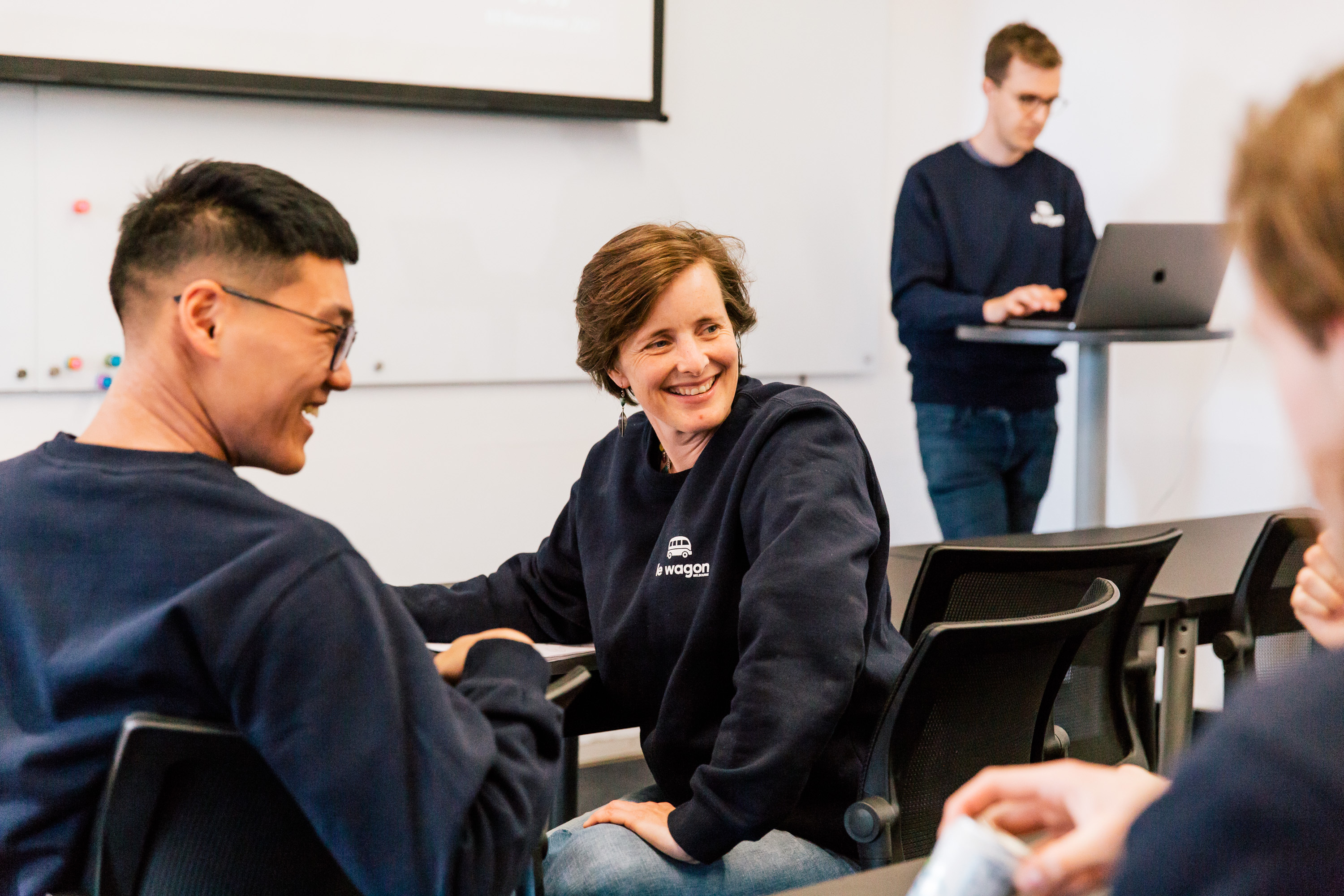
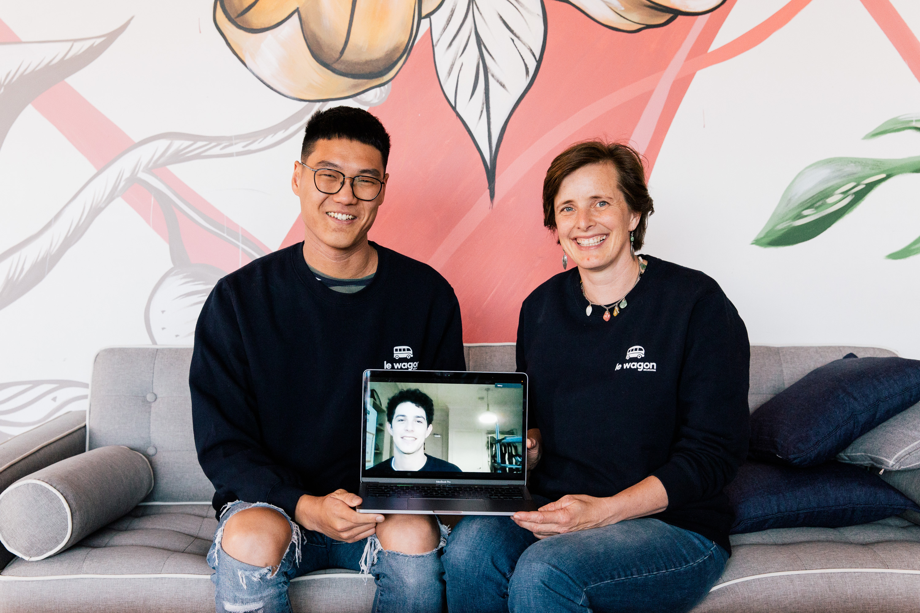
Our team was made of a dynamic group of individuals for a wide variety of backgrounds from engineering, education to bussiness. It was ultimately a terrific diversity that helped to shape the final product…
